When you’re pitching a kitchen remodel to contractors, presenting interior design ideas to family members, or documenting a home project for future reference, a poorly designed slide deck can sink your message. You’ve done the research, measured twice, planned the layout, but if your slides look like they belong in a 2005 office, your credibility takes a hit. Slide deck design isn’t just about making things pretty: it’s about communicating your vision clearly, keeping viewers engaged, and making sure your ideas stick. Whether you’re showcasing a before-and-after bathroom renovation or walking stakeholders through a budget breakdown, strong design transforms information into persuasive storytelling.
Table of Contents
ToggleKey Takeaways
- Strong slide deck design enhances credibility and communication by removing mental noise, helping contractors bid accurately, and keeping viewers engaged with your home project.
- Apply the one-idea-per-slide rule and embrace restraint by letting key visuals dominate—avoid cluttered layouts, excessive text, and decorative elements that distract from your core message.
- Use contrast, hierarchy, and the rule of thirds to guide viewer attention, ensuring headings are bold, key numbers stand out, and images occupy 60–70% of space with minimal overlay text.
- Establish consistency through a master slide template with your logo and heading styles, then customize ruthlessly by adjusting margins, fonts, and color palettes to match your project’s unique vision.
- Choose accessible tools like PowerPoint or Google Slides over complex design software, and avoid preset animations or transitions—let your content be the focus, not flashy visual effects.
Why Slide Deck Design Matters for Your Home Projects
A well-designed slide deck isn’t vanity, it’s a project management tool. When you’re managing a renovation, getting financing, or coordinating with contractors, your presentation shapes how people understand and trust your vision. Poor slides create friction: viewers struggle to follow your logic, they miss critical details, and they question your professionalism. By contrast, thoughtful design removes mental noise. Your audience absorbs information faster, retains it longer, and feels confident moving forward.
For homeowners specifically, a clean presentation signals that you’ve thought things through. Contractors are more likely to bid accurately when they can clearly see dimensions, material specifications, and scope. Family members buy into a project when they can visualize the end result without squinting at a cluttered timeline. If you’re applying for permits or financing, building inspectors and lenders expect documentation that’s easy to review. Design isn’t decoration, it’s respect for the viewer’s time and attention.
Essential Design Principles for Clear, Compelling Slides
The strongest slide decks follow a few core rules that keep viewers focused and comprehending.
Prioritize one idea per slide. Your audience can’t absorb a paragraph of text and analyze a detailed floor plan and study a cost breakdown all at once. Pick the primary message, “This wall is load-bearing” or “Budget: $18,000”, and support it visually. Everything else belongs on a second slide or in speaker notes.
Embrace restraint. Fewer elements always win. If you’re showing before-and-after photos of a living room, let those images dominate. Don’t surround them with decorative borders, unnecessary captions, or spinning transitions. The content is the star: design is the supporting actor.
Use contrast to guide attention. A darker background makes lighter text pop: a smaller detail draws focus because it stands apart from larger elements. If you want viewers to notice the project timeline, make it bold or use a contrasting color. If you’re showing a floor plan, use color-coding (blue for plumbing, red for electrical) to highlight specific systems without overwhelming the layout.
Build hierarchy into every slide. Your viewers should immediately understand what’s most important. Headings should be larger and bolder than body text. Key numbers or specs should stand out. Images should be crisp and sized appropriately, not thumbnail-sized on a projection screen.
Practical Layout Strategies That Work
Layout is the skeleton of every slide. A strong layout keeps viewers oriented and moving through your narrative.
The rule of thirds is a photographer’s trick that translates perfectly to slides. Divide your slide into a 3×3 grid (imaginary, not drawn) and position key elements along the grid lines or at intersections. A headline in the top third, a large image in the center, and supporting text in the bottom third naturally feels balanced and guides the eye in a logical sequence. Avoid centering everything: asymmetry is more dynamic and easier to read.
Establish a margin system. Leave breathing room around the edges, don’t stretch elements to the slide edges. A consistent margin (roughly 0.5 inches on all sides) makes slides feel professional and prevents text from being cut off if the projector overscans. Within that margin, use a grid to align elements vertically and horizontally: misaligned text and images look careless.
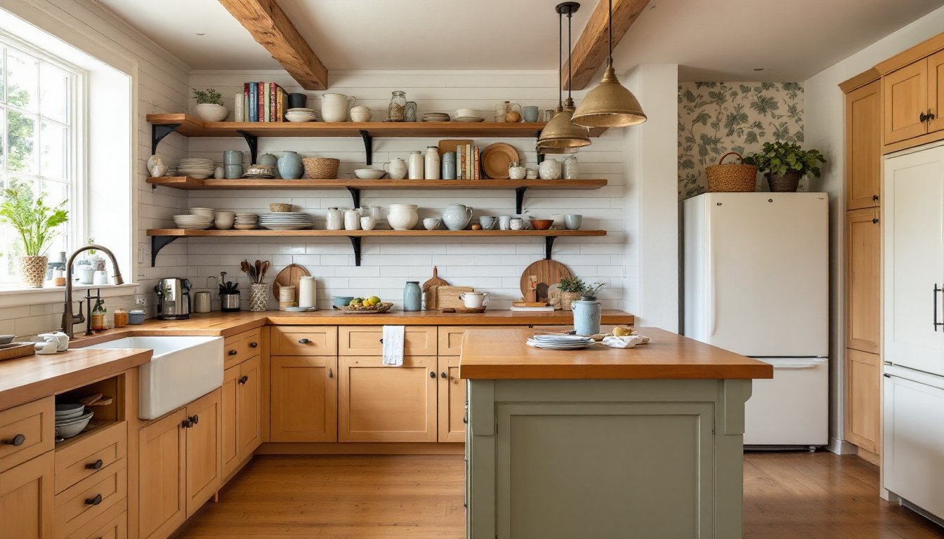
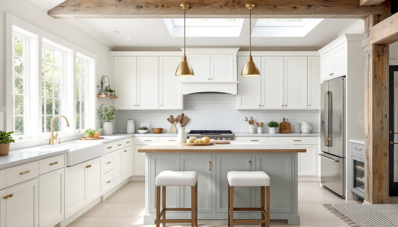
Pair images with supporting text strategically. If you’re showing a kitchen renovation, a large before-and-after photo should occupy 60–70% of the slide, with dimensions or material specs in a label or inset. Don’t shrink the photo to make room for verbose captions: let the image breathe. Platforms like Houzz and Dwell do this exceptionally well, pairing stunning visuals with minimal overlay text, a pattern worth emulating in your own decks.
Choosing the Right Tools and Templates
You don’t need design software to create a solid slide deck. PowerPoint is the workhorse: familiar, reliable, and packed with templates. Google Slides is lighter, cloud-based, and easier to collaborate on if contractors or family members need to review drafts. Keynote (Mac/iPad) is polished and minimal, though it’s less universal for sharing. For homeowners, PowerPoint or Google Slides cover 95% of use cases.
Start with a template, but customize it ruthlessly. Templates get you 80% there: a sensible layout, a coordinated color scheme, and placeholder text. But a generic template used as-is reads as lazy. Delete elements you don’t need. Adjust margins and spacing to your content. Swap in your own color palette if it better reflects your project. Choose fonts that feel right for your brand (a minimalist modern kitchen deserves cleaner fonts than a rustic farmhouse renovation).
Build a simple master slide with your logo, consistent heading styles, and footer information (project name, date, slide number). Most presentation software includes a master slide feature that applies these rules across your entire deck automatically, one small setup that saves hours and ensures consistency.
Avoid preset animations and transitions. Dissolves, spins, and fly-ins distract viewers and date your deck faster than anything else. A simple fade between slides is sufficient. Let your content be the moving part, not the slides themselves. If you’re presenting to contractors or lenders, flashy transitions undermine your credibility: subtlety wins.
Conclusion
Strong slide deck design boils down to clarity, restraint, and consistency. One idea per slide, intentional hierarchy, generous white space, and precise alignment transform your presentation from forgettable to persuasive. You don’t need design training or expensive software, just an understanding of how viewers absorb information and a commitment to removing unnecessary noise. Your project deserves to be understood. Make your slides earn that understanding.